There’s no doubt that one of the best things about gift giving, at Christmas or any time, is the element of surprise. You take a perfect gift and conceal its awesomeness behind pretty paper. Then the big moment comes where the receiver tears open that paper to reveal the big surprise and, you hope, be surprised during the process. But with some gifts, you can put away the paper, scissors, and tape, especially video games with incredible cover art! For our third list of Listmas, our goal is to pick games with art that didn’t need to be hidden behind even the shiniest of wrapping paper; because with great cover art , the package makes perfect!
Galaga
When it comes to classic video games, the ones that once loaded arcades and Ataris, having great art to accompany your screens of beeping and booping pixels was key. Because graphics were, well…what they were in the 1980s, game art had to sell an idea, a fantasy, an image that would take off in your imagination. I can think of no better example of that than Galaga.

Everything about Galaga’s art is fantastic, from the futuristic font to the racing alien insect that’s practically popping off the box. In it is imbued notions of science fiction, adventure, and battling for the future – all key elements in the game itself. Heck, if wrapping paper existed that had Galaga’s motifs on it, I’d wrap everything in it! Except the game, of course.
Dragon Age: Origins
Sometime simple is best. It’s fine when game art goes the extra mile to help boil down a complex game into a single, intricate image, but when that extra mileage can be saved, the results are often just as good, if not better. Take for example, my second pick: the box art for Dragon Age: Origins.

Okay, so maybe it doesn’t scream “holiday cheer,” but DAO’s uncomplicated take on fantasy art is refreshing and eye-catching. The devil really in the details, and the more you look, the more you see beyond just the blood-red splash of a dragon.
Kingdom Hearts
Just like with movie posters, gaming box art is replete with repeated visual styles – some become classics, others…eh, not so much. Take the typical fantasy scene of the hero featured prominently, often with weapons in hand, while surrounding by several supporting characters. When it comes to this particular motif and games, I certainly wouldn’t wrap up the cover of Kingdom Hearts.
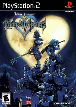
Not only does Kingdom Hearts have one the prettiest logos in gaming, but the image of our main character, Sora, looking to the dark skies in front of a bright, heart-shaped moon is unforgettable. Add to that his friends Kairi (also looking up with hope) and Riku (in a foreshadowing pose), with Donald Duck and Goofy rounding out the scene, and you you’ve got yourself a gift worth giving.
Donkey Kong Country
When Nintendo gave us the Nintendo 64, it launched an entire generation of game players into the stratosphere. Of course, we loved our 8- and 16-bit games to pieces still, but when we first saw Mario in all three dimensions, it was nothing short of magic. With that magic came a slew of new visuals that graced many an N64 box, including one of my favorites, the art for Donkey Kong Country.

I recall being far more excited for DKC than anything else based on the box art alone. Donkey Kong is practically running off the box with those bananas! And what’s the behind him? A rhino? Some sort of beaver?? A snake?? Another ape, with more apes??? And what’s with all the wasps??! Nintendo tried to build upon DKC’s wonderful collage with subsequent games in the series, but the first, in this case, is the best.
Horizon Zero Dawn
What makes cover art so good that you don’t want to hide it? There has to be something about the image that’s make such an impact that it draws you in at first sight. In recent times, I can think of no more compelling image, and one that I wouldn’t want to hide from anyone, than the one gracing the cover of the general release of Horizon Zero Dawn.

If a picture’s worth a thousand words, this one could easily be a novel. We have our prehistorically modern hero poised below a huge, menacing creature, one that appears both mechanical and biological. In the distance are signs of both life and decay. It’s these many juxtapositions that make for a powerful image and serve to tell the player of what’s to come. Wrapping paper begone, I say!
Lede image features cover art from Galaga for the Atari 7800 (© Atari Corporation).

I remember getting Dragon Age: Inquisition around Christmas time too. I really like that artwork, it has a darker vibe than Origins but still feels striking 🙂
LikeLiked by 1 person
The whole series has excellent box art! Inquisition’s art intense and fits the game perfectly. Origin’s art is simple but mysterious. Leaves players guessing a little as to what’s ahead.
LikeLiked by 1 person