Wrapping paper is not usually sufficient to hide the presence of a video game. We all know the relative shape and size, so it’s really just to hide its specific identity. But there are some games that are just too beautiful to be covered up by some brightly colored, winter-themed paper. For these games, you might as well save your wrapping people and leave the game bare for the whole world to see!
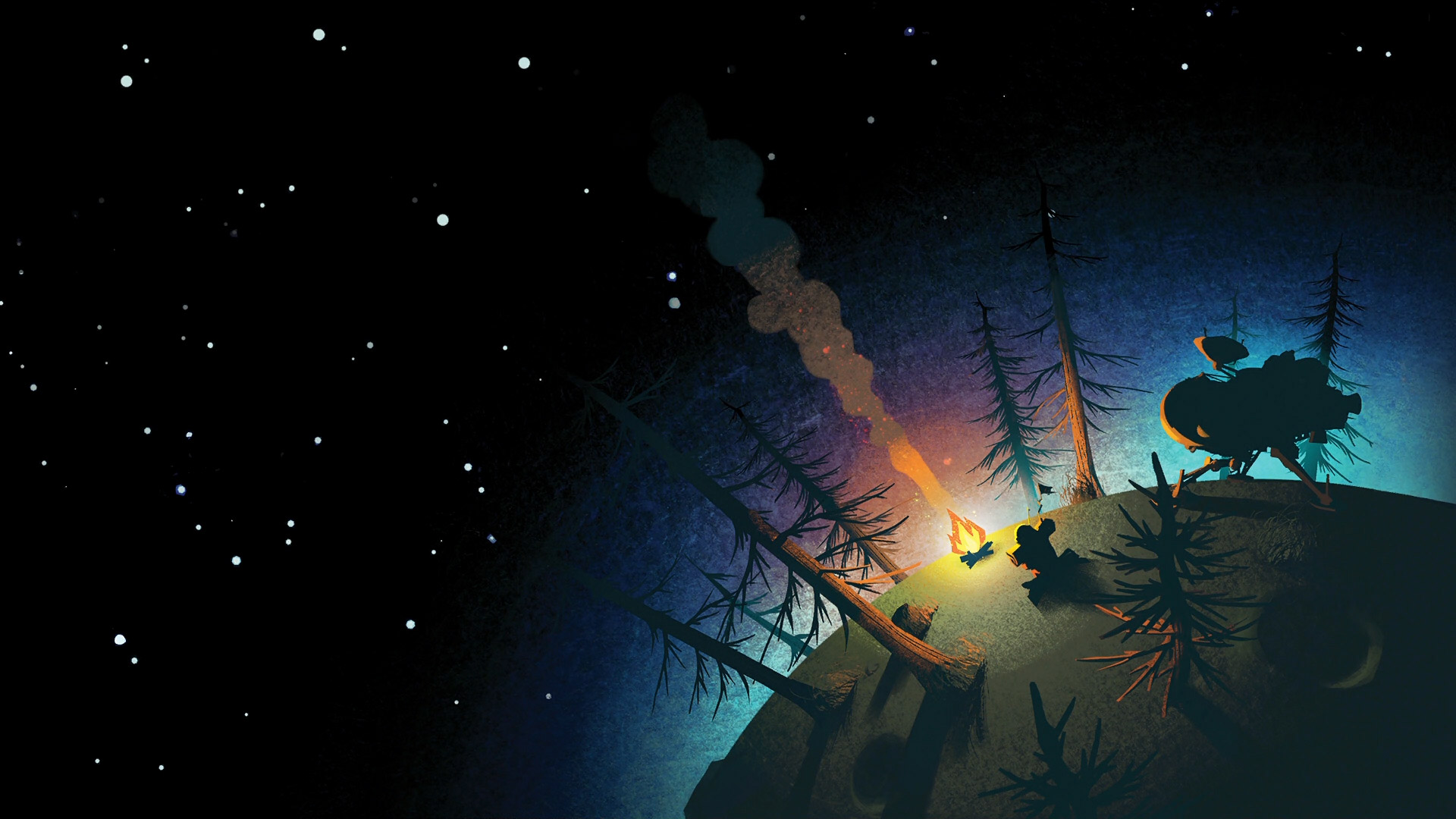
- Outer Wilds: A good cover should effectively showcase what makes this particular game special, and Outer Wilds chose to combine two things that don’t feel like they should go together, the cold depths of space and a cozy, rustic campfire in the woods. Sure, these woods represent your home planet of Timber Hearth, and you can find campfires on the various planets, where you can take a break from your journeys and roast a marshmallow. But I think what’s truly brilliant about including those woods on the cover is not their literal presence in the game, but what they represent. This is not, in fact, a story about the cold, unfriendly vacuum of space, but a personal one about our tiny selves and our efforts to understand a massive, unfathomable universe.
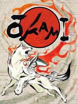
- Okami: Okami has made it into my lists twice this Listmas and for good reason. I remember when I first saw its box art in the store, it immediately stuck in my mind, even throughout the many months between the first time I laid my eyes upon it and the day I returned to buy it and finally make it my own. I just love the look of this game’s box art, with that white wolf and the big red sun in that sumi-e style. This cover showcases why less is indeed more and why a simple cover can often be better than an overly complicated one.
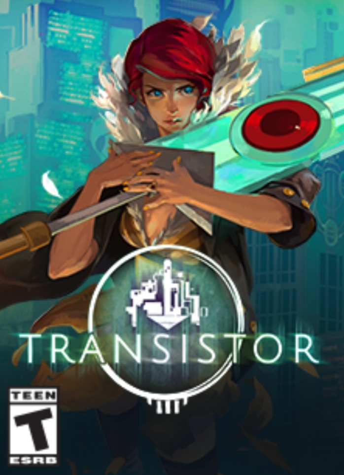
- Transistor: This striking cover showcases Red and her talking sword companion front and center. This cover is as beautiful to look at as the game it represents, and I think it speaks for itself.
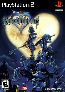
- Kingdom Hearts: I usually prefer simple covers, like the one for Transistor, but the box art for Kingdom Hearts is one example of a more crowded cover that I really enjoy looking at. Featuring Sora, Riku, Kairi, Donald, and Goofy in front of the titular Kingdom Hearts itself, I just love the composition of this cover and the two main colors. Even with the presence of five characters, making everything blue allows Kingdom Hearts to really stand out. There’s a somber quality to this box art that immediately tells the viewer to not be deceived by the presence of Disney characters because Kingdom Hearts will be an emotional journey. Just looking at this cover fills me with nostalgia.
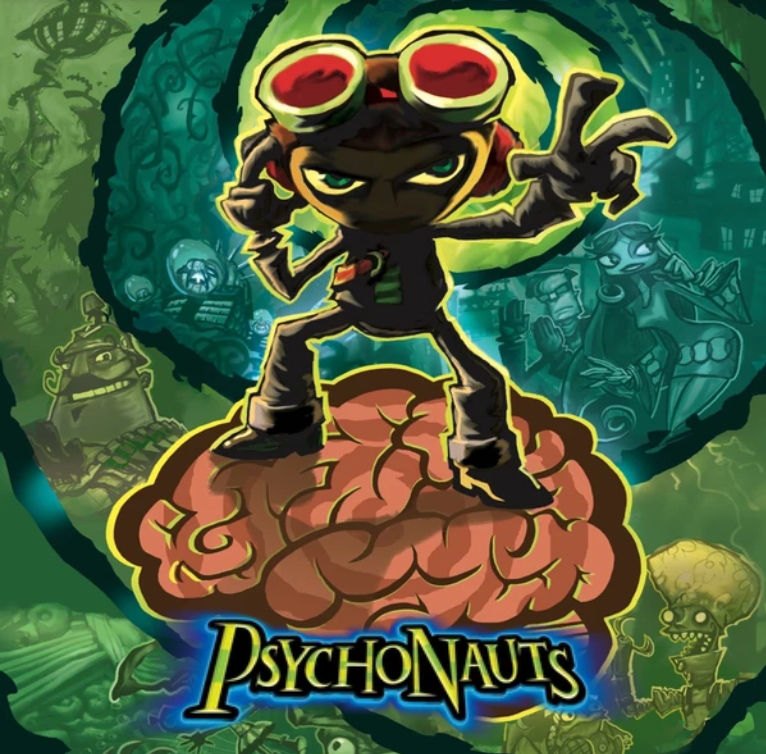
- Psychonauts: Psychonauts has another really cool cover that knows how to get across the zany adventures you’re about to go on, with snippets of characters and places nestled about the swirl spiraling around our main character, Raz. Once again, we see how colors keep a cover from getting too complicated, with the green background and the limited colors of Raz and the brain.
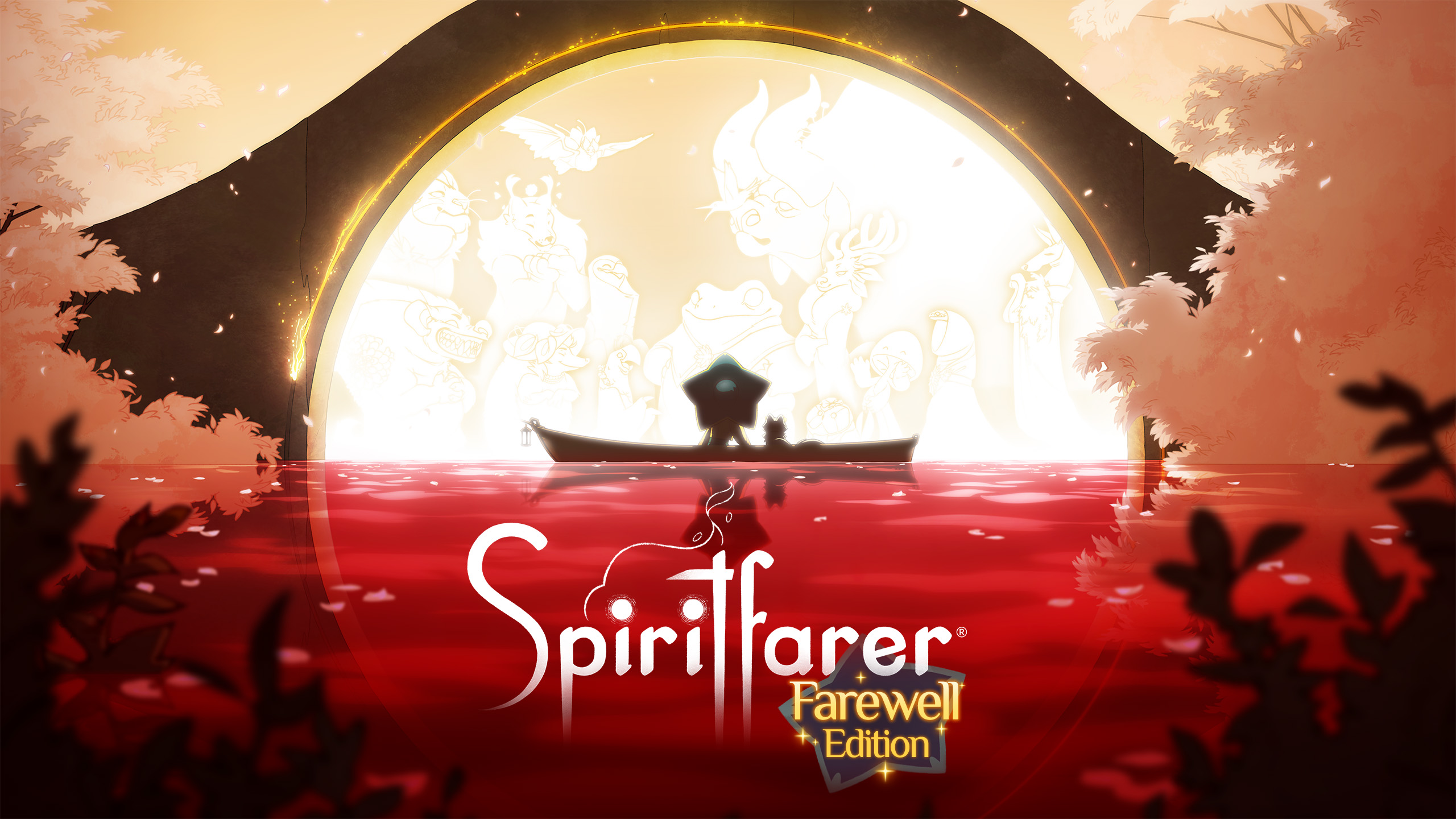
- Spiritfarer: This beautiful game about ferrying the dead to the afterlife has an equally beautiful cover, with Stella and Daffodil sitting in their boat before the arch where all spirits go when it’s their time to move on. The red of the water is striking and stands out well against the white of the spirits we get to know over the course of the game.
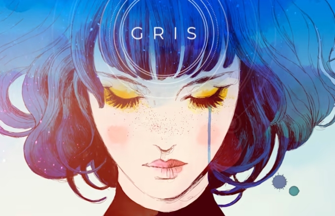
- Gris: Another beautiful game whose cover alone evokes the same emotions as the game itself. The single tear running down Gris’ face is enough to tell you that this is a game about grief. As with the cover of Spiritfarer, just looking at it makes me a little teary-eyed.
Banner image is the artwork for Abzu, another game deserving of being on this list
